
The most honest sentence written about activity scores is sitting in the help centre of the company that sells them. Hubstaff's documentation explains that its activity level is "the percentage of keyboard and mouse strokes over the total time tracked", then adds, a few paragraphs down, that "people with 75% scores and those with 25% scores can often times both be working productively."
Read that twice. The vendor selling the number tells you the number does not rank your team. That caveat lives in the help centre. The number lives on the dashboard, in a column, next to people's names.
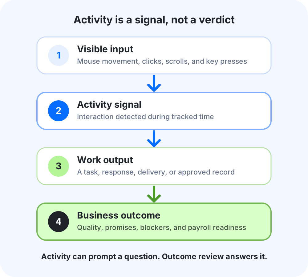
The caveat matters wherever the score appears beside a person's name: the formula measures input, while interpretation still requires context.
The vendor, research, and survey sources cited below were rechecked on September 8, 2026. This is a desk review, not a hands-on product test, and the examples are not Kordano customer results.
The answer in 60 seconds
An activity percentage records visible keyboard and mouse input. It can surface a period worth reviewing, but it cannot show whether work was correct, useful, or delivered on time. For knowledge teams, use activity as context for a conversation, not as a performance verdict.
- Review productivity primarily at team level, not by ranking unrelated people
- Choose metrics that change a real management decision
- Pair every metric with a guardrail against gaming
- Compare a team with its own history and workload, not a universal benchmark
- Use activity to ask a question, never to answer one by itself
Jump to: the seven metrics · how to implement them · the four-question test · where KordanoTime draws the line
Seven employee productivity metrics to measure instead
A representative management question is why a steady engineer posts the lowest activity number on the team. The answer may sit in the role or work context. It is a fair question because the tool invited it.
The seven labels below make up the Kordano Outcome Review Framework. They are working definitions for this article, not universal industry standards. Pick the two or three that match the decisions a team owns, review them at team level, and keep each definition stable long enough to learn from the trend.
Table: seven productivity metrics that connect work to a decision instead of treating visible activity as performance.
| Metric | What it measures | The decision it should change | Guardrail |
|---|---|---|---|
| 1. Commitment reliability | The share of agreed work completed by the promised date | Reduce scope, remove a dependency, or reset an unrealistic commitment | Record why a commitment moved. Do not reward teams for making smaller promises |
| 2. Cycle time | Elapsed time from an accepted request to accepted completion | Fix the slowest handoff or approval step | Compare similar work over time, not unrelated roles |
| 3. First-pass quality | Work accepted without reopening, correction, or avoidable rework | Slow a rushed process, improve the brief, or add a review checkpoint | Define meaningful rework before counting it. Small edits are not failures |
| 4. Customer promise performance | Replies, resolutions, or deliveries completed inside the promise made to the customer | Add coverage, change the promise, or remove a recurring service bottleneck | Measure the promise that matters, not raw message volume |
| 5. Blocked-work age | How long active work waits on a decision, dependency, access request, or missing input | Give a manager a specific obstacle to remove | A blocker must name an owner and next action, or the label becomes an excuse |
| 6. Payroll readiness | Timesheets approved before cutoff, with unresolved exceptions shown separately | Chase the right reviewer, correct a record, or hold the payroll handoff | Never hide exceptions inside an average approval rate |
| 7. Sustainable workload | Overtime, after-hours work, or overload concentrated across several weeks | Rebalance work, adjust staffing, or stop overcommitting | Review trends with the team. One late night is not a performance diagnosis |
The third column is the point. A useful productivity metric should tell a leader what to change. The guardrail matters just as much, because every outcome number can become another activity score once it is stripped of context and attached to an individual target.
How to implement the seven metrics
There is no responsible universal target for these measures. Start with a stable definition, establish the team's own baseline, and investigate changes rather than rewarding a number in isolation. The examples below are illustrative, not Kordano customer data.
1. Commitment reliability
Use this only where a team makes explicit, time-bound commitments. Calculate work completed by the agreed date divided by all commitments due in the period, multiplied by 100. If 17 of 20 agreed items were completed on time, the illustrative result is 85 percent.
The project owner should review it at the end of each delivery cycle. Open the three misses and classify the cause: scope growth, dependency delay, unclear ownership, or unrealistic planning. The management decision comes from those causes, not from chasing a higher percentage next week.
2. Cycle time
Cycle time starts when a comparable request is accepted and ends when it is accepted as complete. Track the median rather than letting one extreme item distort the picture. If similar requests usually take three to five days and the median moves to seven, inspect the slowest handoff before asking people to work faster.
A team lead or operations owner can review this weekly or monthly, depending on volume. Keep unlike work in separate groups. Comparing a support reply with a software release produces a precise-looking number that means nothing.
3. First-pass quality
Calculate completed work accepted without meaningful reopening or correction divided by all completed work, multiplied by 100. An illustrative 18 accepted items out of 20 gives 90 percent first-pass quality. Define meaningful rework before collecting the number so small edits do not become failures.
The owner may be a team lead, reviewer, or quality lead. Review the reasons behind rework monthly: unclear briefs, missing acceptance criteria, rushed execution, or an ineffective review step. The response should improve the process, not penalise the person attached to the last edit.
4. Customer promise performance
For support, delivery, or service work, divide promises completed inside the stated window by all promises due. If 46 of 50 due items were completed inside the promised window, the illustrative rate is 92 percent. Use the promise made to the customer, not raw message volume or an arbitrary speed target.
An operations or service owner should review this at the cadence customers feel, often weekly. A decline can justify adding coverage, changing an unrealistic promise, or removing a repeated bottleneck. Speed without correctness does not count as a kept promise.
5. Blocked-work age
For every active blocker, calculate the time from when it was recorded to now. Review both the median age and the oldest item. Four blockers aged one, two, three, and eight days have a median age of 2.5 days, but the eight-day blocker is the management problem most likely to need action.
Require every blocker to name an owner, a next action, and the dependency being waited on. A manager can scan this daily and review the trend weekly. The purpose is to remove obstacles, not to give stalled work a permanent label.
6. Payroll readiness
Divide complete, approved timesheets by the number expected at cutoff, multiplied by 100, then show unresolved exceptions separately. If 28 of 30 expected timesheets are approved, the illustrative readiness rate is about 93 percent, with two records still named as exceptions.
The payroll reviewer owns the measure during the close. A high percentage is not permission to hide the remaining records. The decision is whether to chase a reviewer, correct an entry, or hold the handoff until the exceptions are resolved.
7. Sustainable workload
Track after-hours or overtime hours as a share of total team hours, then look for concentration across several weeks. In an illustrative team week, 40 after-hours hours across 600 total hours is about 6.7 percent. The useful question is whether those hours are repeatedly landing on the same two people, not whether 6.7 is universally good or bad.
Review this with the team and against agreed schedules, contracts, deadlines, and time zones. A manager should use a persistent pattern to rebalance work, adjust staffing, or reduce commitments. Never use one late night as an individual performance diagnosis.
Where to start by team type
Do not install all seven measures at once. These pairings are a starting point, not a standard every team must follow.
| Team | Start with | Why |
|---|---|---|
| Software or product | Commitment reliability, cycle time, first-pass quality | Balances delivery speed with whether work stays accepted |
| Support or customer operations | Customer promise performance, blocked-work age, sustainable workload | Connects service promises with the capacity and dependencies behind them |
| Agency or professional services | Commitment reliability, customer promise performance, payroll readiness | Links delivery promises to the approved records needed for billing and pay |
| Payroll or administration | Payroll readiness, blocked-work age | Makes missing approvals and unresolved exceptions visible before cutoff |
| Creative or research | Commitment reliability, blocked-work age, sustainable workload | Keeps the review on agreed outcomes and obstacles rather than constant computer input |
For payroll teams, the percentage only helps when the process defines who reviews exceptions and who can approve the final record.
For agencies, keep a capacity measure separate from the outcome review. The billable utilization rate guide defines the denominator, catches incomplete-time inflation, and routes the result to demand, scope, pricing, workload, or staffing decisions.
What the percentage actually counts
Strip the marketing away and the mechanics are simple, almost disappointingly so. Hubstaff records mouse moves, clicks, wheel scrolls, and key presses, then divides the seconds where it detected any of those by the total seconds tracked. Its own formula is active seconds divided by 600, over a ten minute window. Time Doctor works the same way: its docs say it counts keystrokes and mouse movements and calculates the percentage of minutes with activity in them.
Both are explicit that they are not keyloggers. Hubstaff does not store which keys were pressed. Time Doctor states that "the specific keys pressed are never recorded." That distinction matters and gets lost in the panic, so it is worth saying plainly: these tools count that input happened, not what the input was.
Which means the metric has one input and it is physical motion. Not judgment. Not correctness. Not whether the thing you built worked.
So the activity percentage is a real measurement of a real thing. It measures how much someone touched their peripherals. Reading it as effort or impact adds an interpretation the number cannot support, and that interpretation tends to penalise thinking.
Hubstaff publishes role examples where useful work can score low. Its examples place a developer debugging code around 30 to 40 percent, a project manager on calls around 25 to 35, and a graphic designer around 35 to 45. The page's point is that activity reflects interaction, not effort or impact. ActivTrak, which sells productivity analytics rather than timesheets, defines its efficiency figure as productive hours over total time and then concedes that "productivity metrics provide the data, but not the context".
Taken together, those vendor pages publish the caveats plainly. A buyer still has to carry the caveat into every review where the number appears.
The four questions to ask before a metric earns a dashboard
Most advice on this topic ends at "measure outcomes, not activity," which is true and completely unactionable. Nobody wakes up wanting to measure the wrong thing. They inherit a dashboard.
So here is the test I would run on anything already on yours. Four questions, and a metric has to survive all four.
Would you act differently at two different values? Take the metric to 40 percent and then to 80 percent, and ask what you would actually do on Monday in each case. If the honest answer is "have a conversation," that conversation is the real tool, and you did not need the number to know the conversation was due. Metrics that change no decision are decoration with a person's name attached.
What does a rational person do to improve it without doing better work? Every metric has a cheat, and the cheat tells you what the metric really rewards. Mouse jigglers and auto-clickers can create visible input without useful work; Hubstaff's own guidance discusses those tools and advises pairing activity with output instead. A metric that can rise while the work does not change cannot stand alone as evidence.
Which role does it quietly punish? An input-only metric tends to punish whoever thinks longest before typing. Read the vendor bands again: the roles that score lowest are debugging, facilitating, and designing. That is not a rounding error, it is the metric working as designed on work it was never built to see.
Could you defend it in a disagreement about money? This is the one that matters at payroll. If someone disputes their hours or a client disputes an invoice, a versioned timesheet with a named reviewer gives the team a reviewable record. An activity average does not, because the first question will be what it measures, and the honest answer is mouse and keyboard input.
The measures worth keeping are boring by comparison. Delivery. Rework. Cycle time. Customer promises. Blockers. Payroll readiness. Sustainable workload. None of them photographs well in a pitch deck. Each can still be gamed, which is why the framework pairs every measure with a guardrail.
When a proxy metric becomes a quota
Goodhart's law gets quoted so often it has gone soft. The original 1975 formulation is drier and more precise than the popular version: any observed statistical regularity tends to collapse once pressure is placed on it for control purposes. The measure stops describing reality at the exact moment reality starts optimising for the measure.
Wells Fargo shows what can happen when a proxy receives pressure and consequences. The US Department of Justice's 2020 statement of facts says the bank's volume-based sales model and management pressure led to millions of unauthorized, fraudulent, unwanted, or unneeded products. Between 2011 and 2016, more than 23,000 employees were referred for sales-practices investigation and more than 5,300 were terminated for customer-facing sales-ethics violations. The independent directors' investigation report filed with the SEC identified a distorted sales culture and performance-management system as the root cause.
Wells Fargo's program was meant to measure and increase customer relationships, not fraud. It picked a countable proxy and attached severe consequences to it. The wider failure also involved incentives, management pressure, weak controls, misconduct, and poor oversight.
An activity percentage with consequences attached uses the same incentive mechanism at a smaller scale. The likely result is not a bank scandal. It is a team learning to keep a hand on the mouse during a phone call because visible input is what the system rewards.
Engineering already ran this experiment
Software is the field with the most countable output in the modern economy, and it is the field that gave up on counting output first. That ordering is not a coincidence.
LeadDev surveyed nearly a thousand engineering leaders in October 2024 and found 70 percent actively avoid measuring lines of code. Not neglect. Avoid. Pull request counts are avoided by 47 percent, tickets closed by 44 percent, story points by 42 percent. The reasons given were the same three every time: the metrics can be gamed, they lack context, and they measure output rather than outcome. What ranked most useful, for the second year running, was cycle time. How long it takes for work to get from requested to done.
The frameworks that replaced counting are worth stealing even if you have never shipped software. DORA's current five metrics are deliberately team-level and deliberately about flow and stability: change lead time, deployment frequency, failed-deployment recovery time, change-failure rate, and deployment rework rate. Its own guidance warns that turning these into targets ignores Goodhart's law and "increases the likelihood that teams will try to game the metrics." A framework shipping with its own abuse warning is a good sign about the people who wrote it.
The SPACE framework, published in 2021 by Forsgren, Storey, Maddila, Zimmermann, Houck and Butler, makes the point this article is built on, in a sentence I wish every dashboard vendor had to display: developer productivity "is about more than an individual's activity levels" and "cannot be measured by a single metric or dimension." Note what that does not say. It does not say activity is worthless. Activity is one of the five dimensions the framework names, alongside satisfaction, performance, communication, and efficiency. It is a legitimate input. It is one fifth of a picture, and it was never built to be read alone.
This is not a software-specific problem. Ask an accounting practice what a good week looks like and you are more likely to hear about returns filed and queries cleared than time in the spreadsheet.
What leaders are actually worried about
None of this is really an argument about metrics. It is an argument about not being able to see the room.
Microsoft's Work Trend Index, surveying 20,006 knowledge workers across eleven countries in mid 2022, found 85 percent of leaders saying the shift to hybrid made it hard to be confident their people were productive. The two questions were different: employees reported whether they felt productive, while leaders reported their level of confidence. The 12 percent of leaders with full confidence and the 87 percent of employees who felt productive can both be sincere. Together, the responses reveal a visibility and confidence gap, which is the gap activity scores are often bought to close.
Slack's 2023 State of Work, covering 18,149 desk workers and executives across nine countries, found 27 percent of executives relying on visibility and activity metrics to judge productivity. In the same population, 63 percent said they keep their status showing as active online when they are not actually working. The measurement and the performance of the measurement, in one survey.
Deloitte's work on the same question found 60 percent of executives tracking things from hours worked to emails sent, with only 15 percent of employees agreeing that kind of tracking helps them work better. A Visier survey of a thousand US employees, and it is worth knowing that is a vendor survey rather than peer-reviewed work, put 43 percent of workers at more than ten hours a week on performative tasks: replying instantly to things that were not urgent, keeping laptops awake.
Which is the part that should worry a founder more than any individual score. Measuring visible activity does not just fail to capture the work. It generates a second, fake job on top of the real one, and your best people are the ones with enough self-awareness to notice they are now doing it.
Where KordanoTime draws the line
Here is the disclosure this article would be dishonest without.
KordanoTime's owner-confirmed plan for December 1, 2026 includes daily-timeline time tracking, online and offline capture, screenshots, video screen recording, schedules, attendance, approvals, leave and break tracking, payroll integrations or payroll-ready exports, office-versus-remote reporting, QuickBooks or more than 60 integrations, jiggler detection, custom subdomains, multiple currencies, and admin impersonation controls. The working product has not been independently verified.
That makes the warning in this article apply to us too. Jiggler detection or a screenshot can surface a question, but neither can answer whether someone is productive. Managers still need the surrounding time record, work result, exceptions, and the employee's explanation before making a decision. When access opens, test whether corrections and approvals preserve a reviewable version with a named reviewer. An average activity score rarely settles an invoice dispute.
Early Access is planned to include 500 screenshots per month; the Team plan is planned to include unlimited screenshots. Owner-approved launch controls say default Kordano-managed screenshots and recordings will use Cloudflare R2, where objects are protected with AES-256 at rest, and the media will travel over encrypted TLS connections. Inspected code supports organization-scoped, permission-checked screenshot viewing, five-minute clear-media links, and blurred delivery when blur is enabled, but working-product and deployment QA remain pending.
GPS, geofencing, and employee-location tracking sit outside the December 1 first release and are planned for a 2027 release. Bring-your-own media storage is planned for exactly Amazon S3 and Cloudflare R2 and covers screenshots and recordings only, never the application database.
Honestly, I think the dashboard is the wrong unit of management when it becomes the decision instead of the starting point. A dashboard answers questions continuously. A review answers a specific question with a person on the other end of it, and it is slower and more expensive and better. Dashboards demo beautifully. Judgment does not demo at all.
I would rather state that bias than pretend we sit outside this category. We are in it, we benefit if you buy tracking software, and you should read this page knowing that. If your conclusion is that you need fewer numbers rather than a different vendor, that is a legitimate outcome and I would rather you reach it honestly than be argued out of it here.
The employee's side deserves the same plainness. Being measured on motion is not a minor irritation. It changes what work feels like, it rewards the wrong instincts, and people notice it faster than managers expect. Any rollout that skips that conversation buys the number and pays for it in trust.
What to do this week
Open whatever dashboard you already have and run the four questions on every number showing a person's name. Some may fail on the first one, and you can remove those without replacing them with another automatic score.
Then pick one outcome measure per team and give it a review slot rather than a widget. Delivery against what was committed for a software team. Queries cleared for an accounting practice. Tickets resolved inside the promised window for support. Timesheets approved before the cutoff for anyone running payroll, which is the measure that pays for itself fastest because it is the one that stops the week ending in a spreadsheet reconciliation.
Give that two quarters and the argument changes shape. The question in review stops being why someone's number is low and starts being what is in the way, and those are different meetings with different outcomes.
If you want to examine the planned December 1 review approach, start with the review flow. Judge it after access opens on whether the weekly pass actually closes your payroll, not on the number of charts. For the wider question of which tracker fits your situation at all, we wrote a buyer's guide sorted by situation rather than ranking. If the budget conversation is the live one, what tracking actually costs does that arithmetic. And if the team is working all day but important work still slips, the real cost of context switching explains how to audit the working day without blaming the employee.
Back to that help centre page, though, because it is still the best summary of this whole argument. The company selling the activity score wrote down that a 25 percent and a 75 percent can both be someone doing good work. Leading vendors document the caveat. The number still goes on the dashboard because an automatic score is easier to read than a review that needs a person.
The review is still the thing that works. It was never going to be the convenient answer.
Companies with teams of 6 or more can lock $3 per person per month for 24 months.
Claim your spot
Haris Ali D. is the Founder of Kordano, a workforce operating system for modern teams. He focuses on building practical tools for time tracking, attendance, productivity visibility, and team operations.
He also brings experience in branding, digital strategy, and software development through FullStop, a company he co-founded in 2012.